How we improved the CandyBar brand

At CandyBar, we think of our brand as a continuously evolving project that’s never totally done. Just as companies and people evolve, so do brands. We’ve evolved over time, and built a unique culture and an incredible community. Today, we’re taking a bold step forward with an update to the brand.

The earliest version of the CandyBar logo was created in 2016. It was inspired by ReferralCandy, our flagship product that’s been thriving for more than 7 years. We wanted CandyBar to build on top of the familiar vibe we’ve spent years building around ReferralCandy.

Why did we decide to refine our logo?
Our CandyBar community is a diverse collective of small to medium sized business owners. All of these lovely folks have one thing in common: they hustle hard to grow their businesses. Elevating the level of design within our own brand is a way to reflect the quality and nature of our community, and embody that spirit of growth.
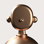
Our old logo inspired by hard candy conveyed friendliness and energy — qualities our smaller businesses appreciated about CandyBar. As a growing brand, it’s now important for us to resonate with a wider variety of merchants of different sizes and industries, and our brand should look strong, balanced and reliable.

We identified weak areas on the old logo; the blue and red spirals not being of a consistent thickness, dual tone shadow at the bottom which renders terribly on printed collateral, and poorly kerned typeface that made it hard to read at smaller sizes. We wanted to emphasise on characteristics like simplicity, memorability, balance and rhythm.
Using geometric shapes and principles from the Golden Circles, we created a logo mark which will create not only harmony and proportion, but also consistency throughout its form. The real reason we use these principles isn’t complex and mysterious, the simple truth is that they produce a well balanced, consistent result.
As György Dóczi writes in The Power of Limits, “The power of the golden section to create harmony arises from its unique capacity to unite different parts of a whole so that each preserves its own identity and yet blends into the greater pattern of a single whole.”

Meet our new typeface — Futura
Futura is commonly considered the major typeface development to come out of the Bauhaus movement in Germany.
Paul Renner sketched the original drawings and based them loosely on the simple forms of circle, triangle and square. The design office at Bauer assisted him in turning these geometric forms into a sturdy, functioning type family, and over time, Renner made changes to make the Futura fonts even more legible.

Futura is timelessly modern; in 1928 it was striking, tasteful, radical — and today it continues to be a popular typographic choice to express strength, elegance, and conceptual clarity.
We chose Futura after careful consideration as it embodies the personality traits the brand is striving for — we hope to be simple, modern and elegant.

Starting today, you’ll see these exciting changes out in the wild, and gradually over the coming months, in-product. We plan to give you a more in-depth peek into the story behind our new logo system, so stay tuned.
Much more to come — onward, team!
If you liked this article hit that ♥ button below and share this with all your Medium friends!